
> Introduction <
All the design elements you need. Here, in one place. And how to use them. From the smallest digital icon to the largest printable billboard.
Our brand’s DNA visually represented by a unique combination of logo, colour and fonts.
Read on to discover how we apply this unique combination in order to maintain total branding consistency throughout.
Whatever the media, the outcome of these guidelines is to ensure brand continuity.
> Brand Identity <
The purpose of this section is to connect our audience with the vision of what we do and why we do it.
Using simple words to articulate the heart and soul of our brand.
These core principles and standards define our brands DNA.
It is what we stand for and what makes it special.
Mission Statement
We help small business owners get results online whilst enjoying the process.
Values
Make things simple
Enjoy the process
Get results
Brand Essence
To provide a calm environment that helps to remove overwhelm by using simplistic design.
> Brand Logo <
When our brand logo is seen by someone for the first time it will tell our story. Designed to evoke a positive emotion. The next time, and every time after, it will trigger that same response. It will tell and keep re-telling our story. It’s the visual bedrock of our brand.
There are simply millions of brand logos worldwide. Even so, ours is unique. To be positioned and placed whenever and wherever we want our brand to be.
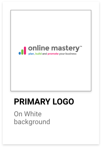
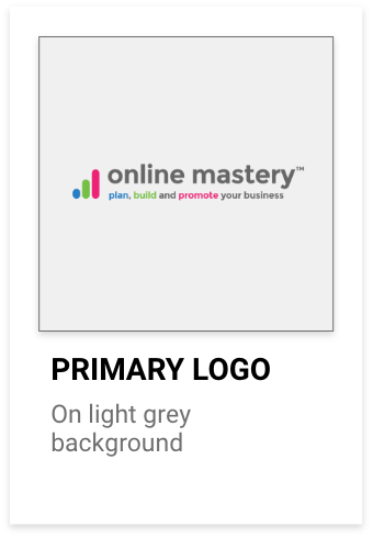
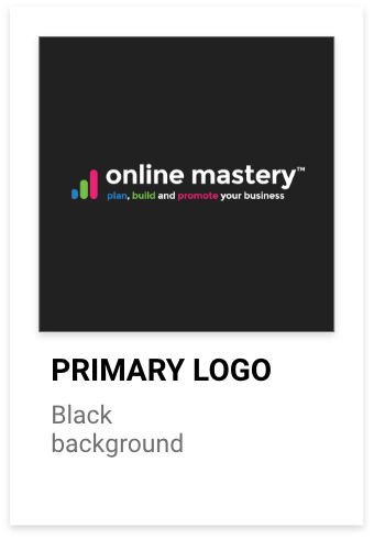
Primary logo
Our brand’s identity is expressed typographically in the form of a word, styled into an icon.
Variants of the icon are displayed here.
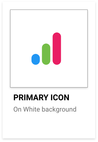
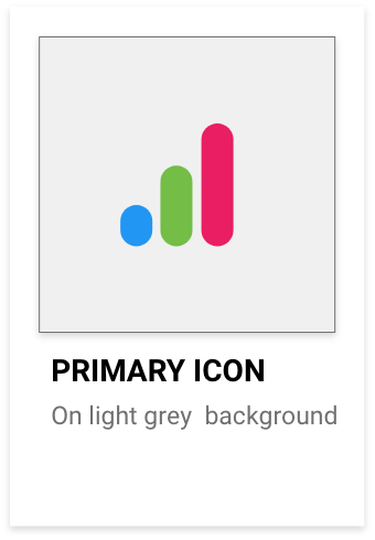
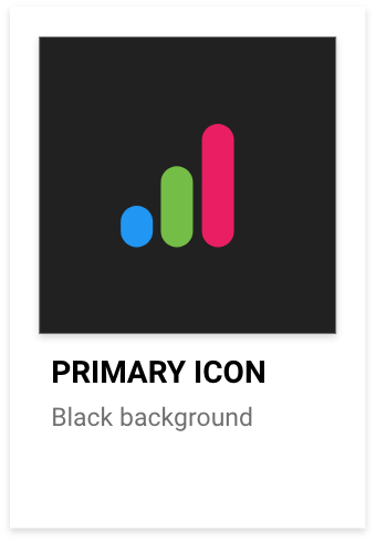
Primary logo correct usage
Logo mark on white, light grey and black background
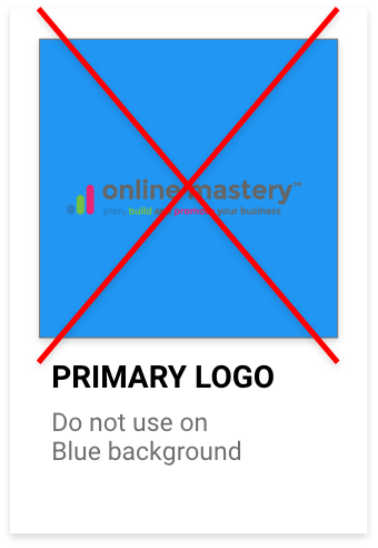
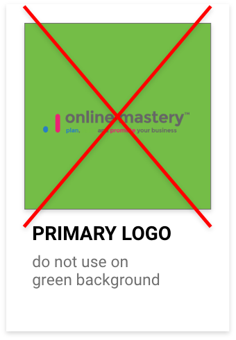
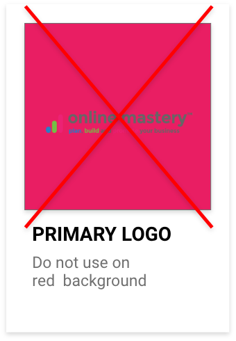
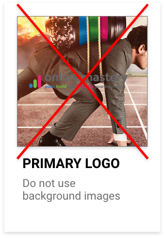
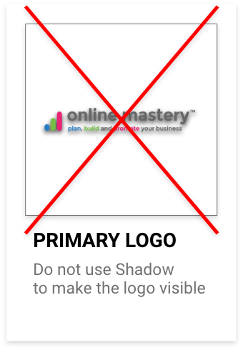
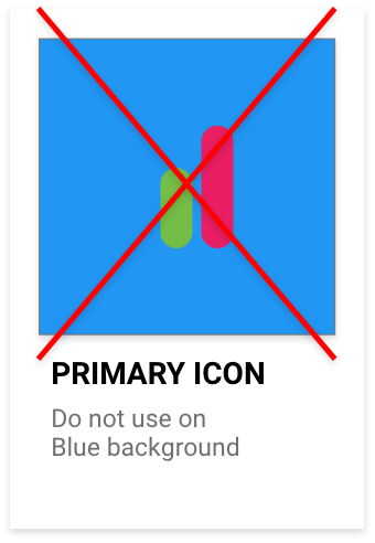
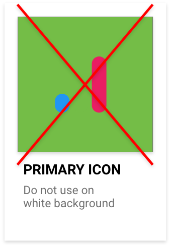
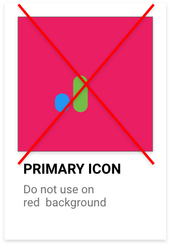
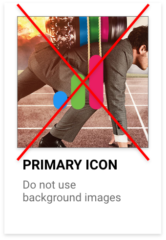
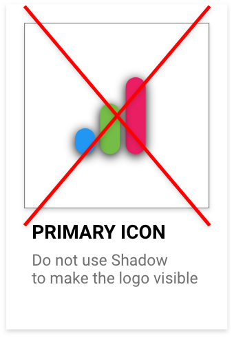
Primary logo error
Ensure not to do the following:
Do not place the colour logo onto a key colour background, this making the element of the logo appear ‘invisible’ and incorrect. See below for examples
Brandmark
Our brand’s identity is expressed typographically in the form of a word, styled into an icon.
Variants of the icon are displayed here.
Logo mark on white, light grey and black background
Brandmark error
Ensure not to do the following:
Do not place the colour logo onto a key colour background, this making the element of the logo appear ‘invisible’. See below for examples
Logo size
The combination Logo Type
The height relationship between the logo ‘mark’ and the logo ‘type’ should be consistent whenever used in conjunction with each other. See below for the ratio between the two logo elements.
> Brand Colours <
When our brand logo is seen by someone for the first time it will tell our story. Designed to evoke a positive emotion. The next time, and every time after, it will trigger that same response. It will tell and keep re-telling our story. It’s the visual bedrock of our brand.
There are simply millions of brand logos worldwide. Even so, ours is unique. To be positioned and placed whenever and wherever we want our brand to be.
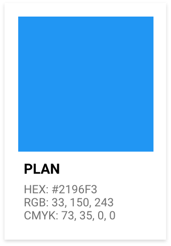
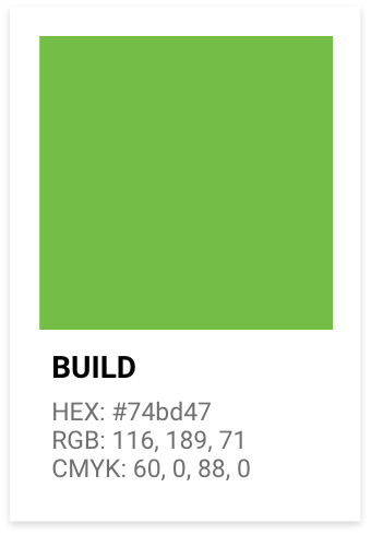
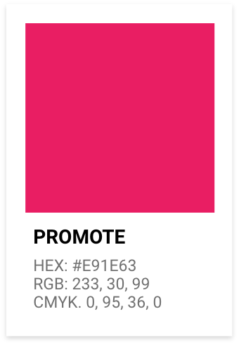
Primary Brand Colours
Consistent use of specified colours will encourage and reinforce audience association with our brand.
OFFICIAL CONTENT NEEDS TO GO HERE
Red and yellow are in the same segment on the colour wheel. They’re both associated with warmth, optimism, dynamism and energy. Of all the warm colours, yellow is considered to be the most energetic. Green represents health and new beginnings. Even wealth! Green is the easy on the eye and creates balance. It is a great colour to use if a company wants to depict growth, security or inspire possibility. We use the primary colour, green – when depicting growth, security and inspiring possibility – to grab attention to our brand.
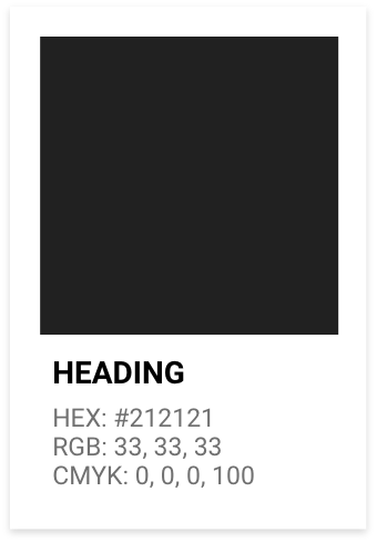
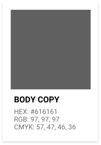
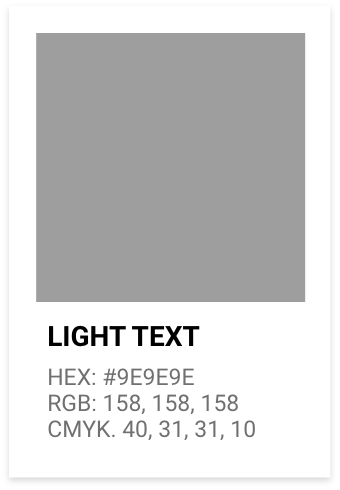
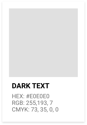
Font Colours
In general, we use greyscale on a light background, especially when text is to be read within paragraphs.
Where our design is best suited to have long copy with a dark background, then we use a grey tint, in preference to white. This prevents stress on the reader’s eyes.
White is used on a dark background where the user will be scanning, as distinct from reading.
In every case the specified HEX, RGB and CMYK codes are used, as appropriate.
> Brand Buttons <
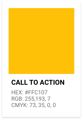
Our brand buttons align with the three primary brand colours, along with the bonus colour for any key call to action.
Box buttons padding:
TOP: 15px RIGHT: 25px BOTTOM: 15px LEFT: 25px
Font buttons colour:
HEX: #212121 RGB: 33, 33, 33
Box buttons colour:
HEX: #FFC107 RGB: 255, 193, 7
Shadow buttons colour:
HEX: #FFC107 RGB: 255, 193, 7
Hover buttons effect:
HEX: #FFD44D RGB: 255, 212, 77
Headings
H2 – H3 – H4
Body Font
Buttons Fonts
Quotes
> Brand Fonts <
When our brand logo is seen by someone for the first time it will tell our story. Designed to evoke a positive emotion. The next time, and every time after, it will trigger that same response. It will tell and keep re-telling our story. It’s the visual bedrock of our brand. There are simply millions of brand logos worldwide. Even so, ours is unique. To be positioned and placed whenever and wherever we want our brand to be.
Headings should be simple, in sentence case, and finish with a full-stop.
The body copy font is proportional (variable-width), intended for long-form copy that could potentially include multiple paragraphs.
The text in the buttons should be in uppercase.
Here you can see the relationship between the heading font at 1.8 EM and the body copy font at 1 EM.
1 EM = 18px
1.8 EM = 32px
